Lavoro Sicuro
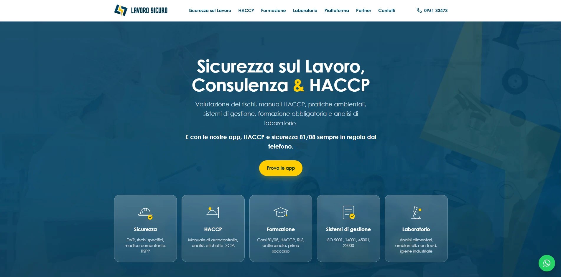
A new visual identity for Lavoro Sicuro, and the platforms behind its two sub-brands: Sicuro81 for workplace safety and Sicuro Food for HACCP.
The brief
Lavoro Sicuro is a Catanzaro cooperative founded in 2013. It advises businesses on workplace safety, quality, food hygiene and the environment, runs professional training accredited by the Calabria Region and operates an ACCREDIA-accredited testing laboratory. Over thirteen years its services had grown, but its image was still that of the training body it started as. It needed an identity that could hold everything together and give its main areas names people would remember.
What we did
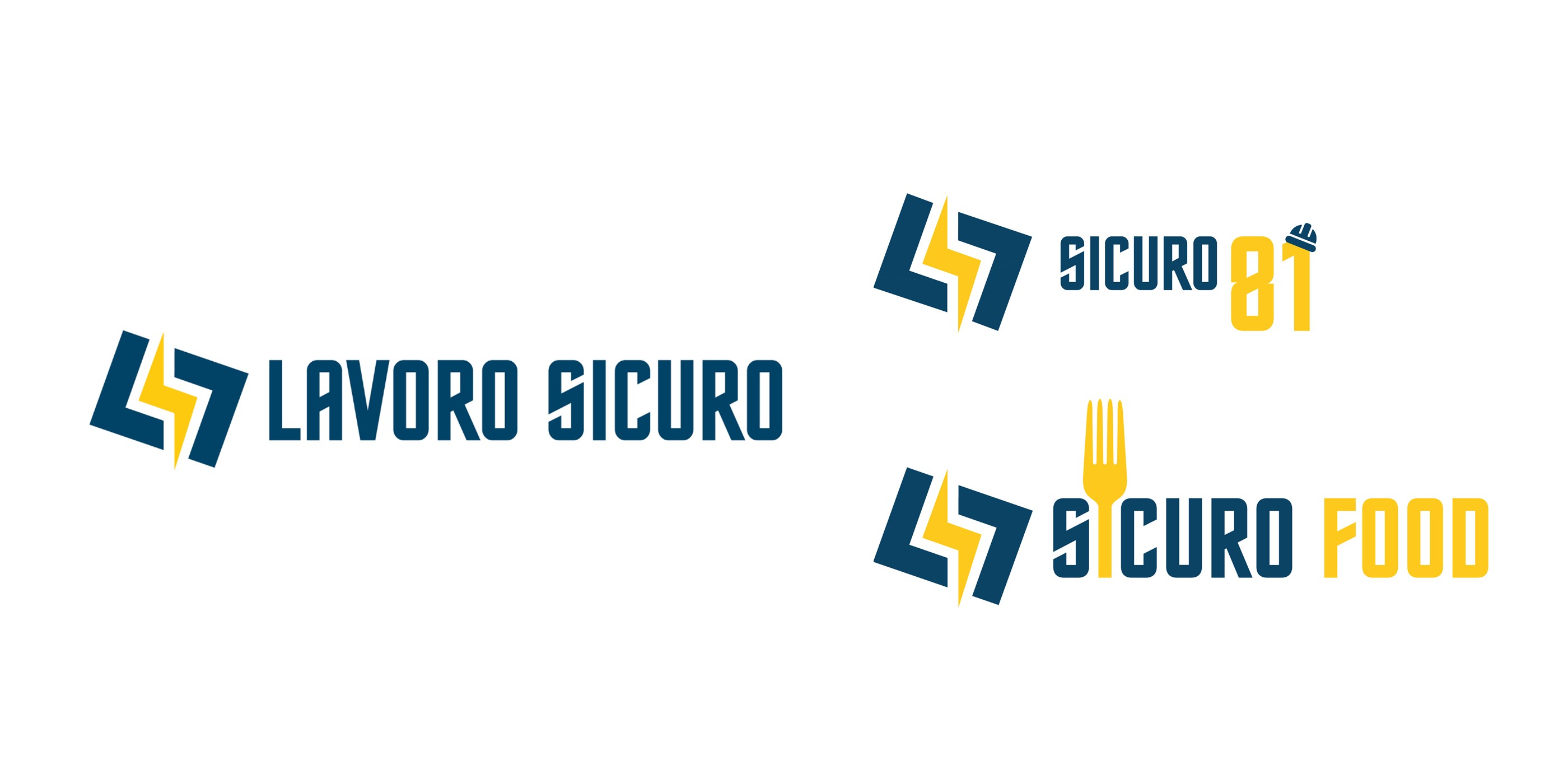
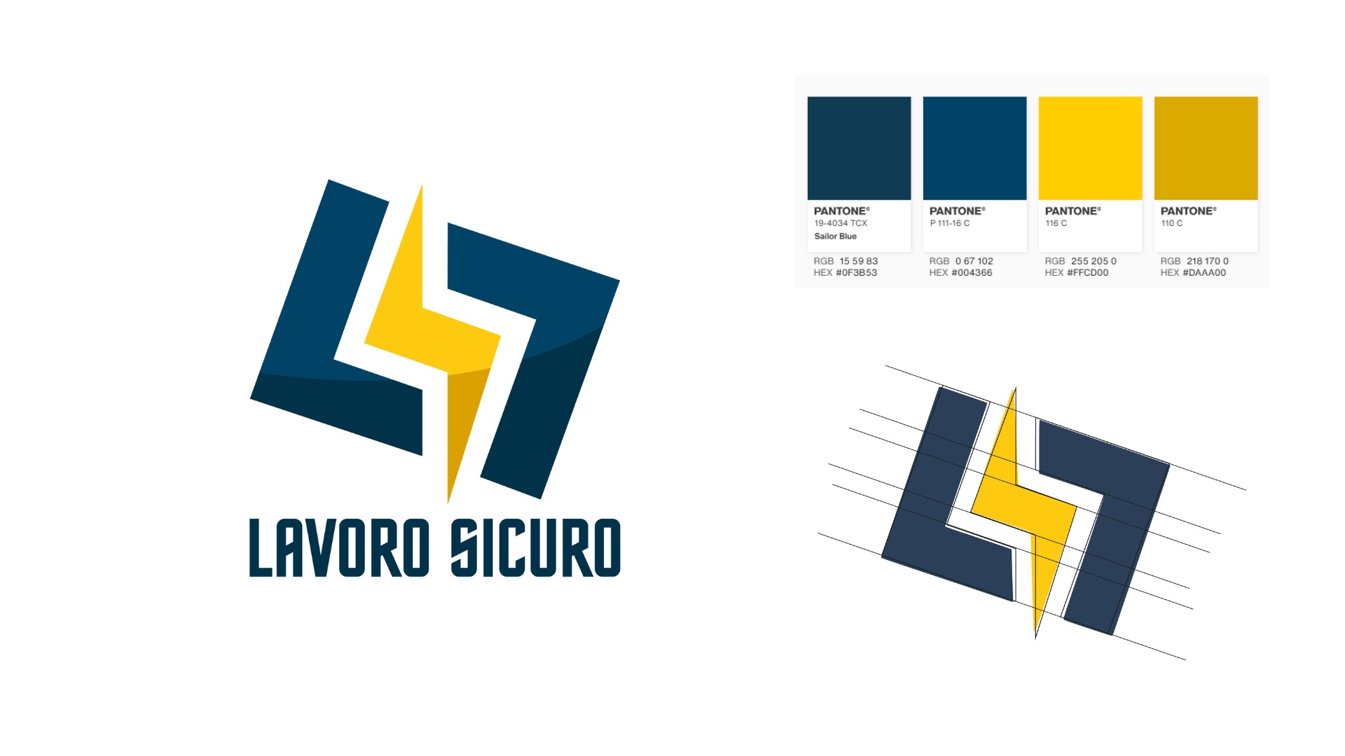
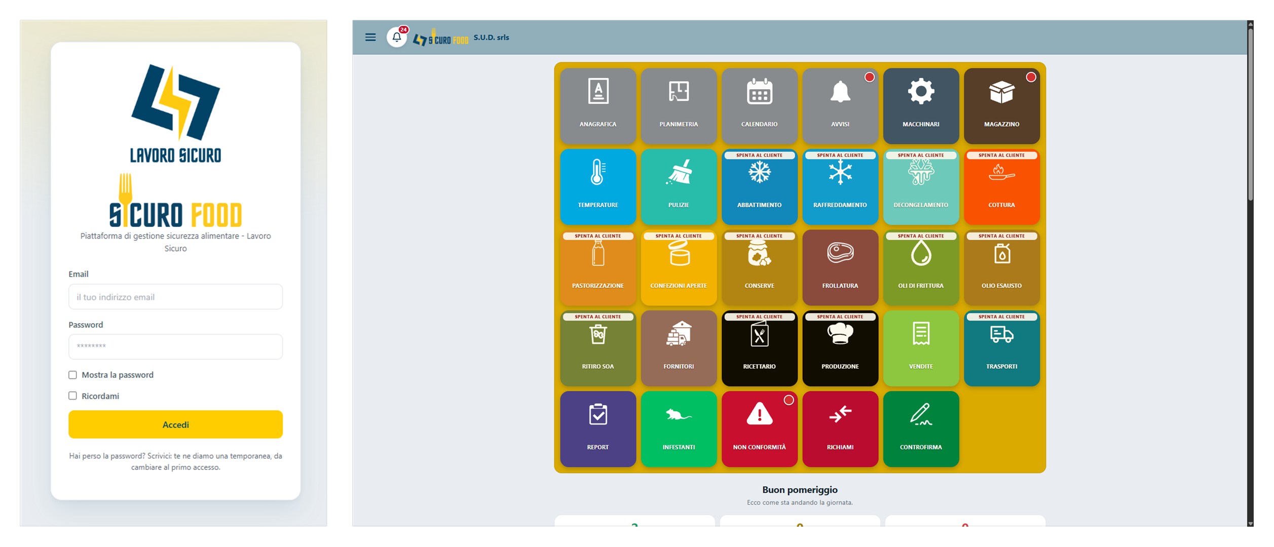
We redesigned the brand from its existing symbol, an L and an S joined by a lightning bolt: flat shapes with no gradients, an angled construction grid, a Pantone palette of two blues and two yellows, and lettering in Staatliches, bolder and legible even at small sizes. Two sub-brands grew from the same system: Sicuro81 for workplace safety, its number referring to Italy's Legislative Decree 81/2008 and a hard hat sitting on the 1, and Sicuro Food for food safety, where a fork stands in for the I. We then built the two platforms that carry those names, which let Lavoro Sicuro look after its clients from their phones: Sicuro81 for workplace safety compliance, and Sicuro Food for HACCP self-monitoring. In Sicuro Food every task has its own tile, from temperatures, cleaning and blast chilling to cooking, suppliers, recipes, non-conformities, reports and countersigning, and the consultant decides which ones each client gets.
The outcome
Text coming soon.
Gallery
Something similar in mind?
Let's talk.
- Studios
- Viale Magna Grecia, 245 · Catanzaro
Piazza San Bernardo, 106 · Rome - Hours
- Mon–Fri, 9 am–6 pm (CET)